In what ways does your Media product use, develop or challenge forms and conventions of real media products?
My front cover has all the conventions you would expect to see on a regular front cover. It has a masthead (Noise), it has a strapline which tells the audience the issue number and the price of the magazine, it has a barcode, it has plugs which advertise other bands and artists that will be featured in the magazine, a main edited image and a main headline.
Before I began making my music magazine, I looked at other music magazines such as NME and Kerrang. I looked at the way both magazines had chosen to set their front covers, and I decided to use NME as a template for my front cover as the front cover NME produced didn't have lots of photo's and writing all over the cover. Whereas the front cover Kerrang produced had lots of photo's and writing all over the cover.
My contents page has all the conventions you would expect to see on a regular contents page, it has page numbers for each of the articles featured in my magazine. Also I have put descriptions of what each of the articles will be about. At the top of the page, I have the words 'Contents Page' in the same font as the one I used for my masthead. I also have smaller edited images at the bottom of the page. Down the side of my contents page I have 'regulars' which are all the regular features which will be in future magazines.
My double page spread also has all the conventions you would expect to see on a regular double page spread. I have a edited main image, I also have three smaller edited images which have all being rotated. Next to the edited image I have written a article on the artist. At the top of the double page spread I have a headline telling the audience who the artist is, underneath this I have a strapline which gives more information on the artist.
How does your Media product represent particular social groups?
My music magazine represents both male and female social groups. On my front cover, I have a female musician, but I haven't used a feminine color scheme. I have used blue, black and white which I would say represents the male social group more.
I haven't just used the female social group throughout my music magazine, I have also used the male social group too, on my contents page I have used two edited images of the male musician. I think the edited images I have used represents male musicians. In the edited images the male musician is stood with a guitar in hand. I have used black and white edited images throughout my magazine to show that my music magazine features serious artists. I also think that my black and white images help to show that Noise magazine represents the indie music genre, as the images show that the musicians featured in this magazine are serious about making music.
The female musician on the front cover of my magazine represents the female musician social group, I think this is because of the way she is dressed.
Also I think the male musician on the contents page of my media product represents the male musician social group, again because of the way he is dressed.
What kind of Media institution might distribute your media product and why?
Bauer Media may distribute my media product, as they don't publish a magazine which focuses on the indie/rock music genre. Bauer Media produce Kerrang magazine which is a magazine that focuses mainly on the rock/screamo music genre. Bauer Media would be a good media institution to produce my media product as because they already produce a music magazine, they will now what they are doing when producing my media product.
IPC produce NME magazine, the magazine which I based my media product on. If Bauer Media were to produce my media product, both NME and Noise magazine would be in competition with each other as they both cover the same music genre.
Who will be the audience for your Media product?
The audience of my media product would be both the male and female audience who are in their late teens, early twenties. But also people older then late teens, early twenties may also want to read my media product as they too may be interested in the indie/rock music genre.
The audience must already be interested in the indie/rock music genre, because if not then they wouldn't be buying my media product. The audience may also be interested in the bands and artists featured in my media product and that could be the reason why they are choosing to read my media product.
How did you attract/address your audience?
To address my audience I have featured both male and female musicians to attract both the male and female audience. I have done this because if I just featured female musicians, I would probably just attract a female audience, likewise if I just featured male musicians, I would probably just attract a male audience.
I haven't used a color scheme which represents either the male or female social group, I have done this to attract both the male and female audience.
I have also featured artists which are already well-known, so that when my target audience are reading my media product they will know who they are reading a article about.
I used informal language in my media product, I did this because I didn't want my media product to be too serious, I wanted to use the language my target audience would use.
What have you learnt about technologies from the process of constructing this product?
Before I started constructing my media product, I looked at other music magazines. I looked at NME magazine and Kerrang magazine. I looked at the way both these magazines were set out. First I looked at the way both magazines had set out their front covers, I looked at the masthead, headline and images both magazines had used. I decided to set my front cover out like NME had set out their front cover, as the front cover NME had produced was simple and didn't have a lot of writing or images on the cover. I thought that this worked well.
Next I looked at the way both NME and Kerrang magazine had set out their contents page, I looked at the images they used, I looked at the regulars and features columns. I decided in my media product I would have regulars. I didn't base my contents page on either NME's contents page or Kerrang's contents page, as I didn't like either of the magazine's contents page's.
Then I looked at both magazines double page spreads, I looked at the images the magazines used and the way they set out their articles. Again, I didn't base my double page spread on either NME's double page spreads or Kerrang's double page spreads.
I decided to edit my images on PhotoShop, I changed the background of the images. On some of the my images, I lightened the backgrounds as it was too dark to begin with. On three of my images, I changed the image from a colour background to a black and white background, I did this because I didn't want all of the images to look the same. None of my main images are in black and white, only the montage images. On the image which I used for my double page spread, I straited the colour from the background of the image leaving only the colour on the musicians clothing visable.
Also on a few of my images, I blurred the background of the image, although you can't really tell on the image.
For all my images, I used the skin cloning tool and the red eye remover tool. I did this because from looking at the music magazines I carried my research out on, none of the images in them magazines had bad skin or red eyes. All the images looked airbrushed and edited.
I used Publisher to put my media product together.
By using PhotoShop I learnt how to edit a image to make the image look it's best. I learnt how to crop, straited, change a background image from colour to black and white, lighten and darken images and blur images. I never knew how to edit a image before, my first draft of my media product wasn't really edited. But I learnt how to edit images and I feel like my final copy of my media product shows this.
By researching music magazines I learnt how publishing companies set their magazines out and the ways in which they try to attract their audiences.
Looking back at the preliminary task, what do you feel you have learnt in the progression from it to the full product?
By doing this media product I have learnt about language, institution, ideology, audience and representation of magazines. Not just music magazines, but the college magazines that I researched for our preliminary task. I have learnt about institutions which produce music magazines and how different genres of music are produced by different institutions. Also, when I was researching music magazines, I learnt the ideology behind certain music magazines. I found out how many people read the music magazines, how long the magazines have been going and how many percentage of males and females read the magazines.
I have also learnt to use PhotoShop more effectively, I have learnt how to edit images to make them look their best. In the preliminary task, I only really had a basic knowledge of PhotoShop, I already knew how to heal peoples skin and get rid of red eye in images, but by doing the music magazine task, I gained a wider knowledge of how to use PhotoShop.
I have also learnt how magazines attract and address their audience, I have learnt how magazines use artists and bands to attract their audience by featuring people who are already in the media for what ever reason.
Also, I have used to Publisher more effetely, I already knew how to construct a magazine using Publisher, but on both my contents page and double page spread I wanted to have smaller images rotated at the bottom of the pages.It was simple to do, but I now know how to do it.
Wednesday, 22 April 2009

Final Front Cover, Contents Page, Double Page Spread

This is my final media product, I think it works a lot better than my draft media product. My draft media product, the person posing didn't look at the camera and the background was too bright and I didn't really know how to change it on PhotoShop. My final media product, the person posing is looking at the camera and the background is a neutral one.


Draft of Front Cover, Contents Page & Double Page Spread

This is the draft of my front cover, contents page and double page spread.
I decided not to use these as my final media product as I didn't think that these looked professional enough for my fianl product. Also the photo's didn't look professional enough as the girl in the photo isn't looking at the camera.


Edited Photo's


These are my edited images, I decided to use two completely different people on my final media product.
I edited my images on PhotoShop. On some of the images, I changed the back ground from a colour background to a black and white background. I did this because I didn't want all my images to look the same, I haven't used any black and white images on my front cover though, as I like my image for my front cover.
Wednesday, 28 January 2009


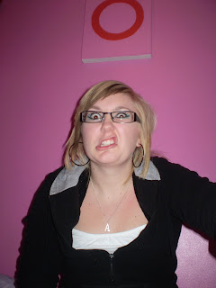


Monday, 26 January 2009
Draft Front Cover, Contents Page & Double Page Spread

Draft of my front cover.
I'm going to feature other artists who are already well known and are in media already. As well as featuring Ami as the new artist.

Draft of contents page. As well as Ami other artists who are already well known. Also I will have a list of all the other bands featured.


Draft of double page spread. Photo and article on Ami.
Monday, 12 January 2009
Contents Page
My contents page will be split up into two different features, one will be features which would be seen in this particular issue and regulars.
Features-
Interview with the artist featured on the front cover.
Interviews with the artists featured in the week's magazine.
Regulars-
Band index (a list of bands featured in the magazine)
Any upcoming gigs and tours.
Reviews of albums.
Posters.
For my features section, I'm going to feature other artists as well as my main artist who will be the main feature of my front cover.
I'm going to give my regular features different names like other music magazine's have, for example my band index will be called 'a-z of bands', upcoming tours will be called 'gigs & tours', album reviews will be called 'reviews' and posters will just be called 'posters'.
To make my magazine seem like essential reading I'm going to make my reviews interesting instead of them seeming repetitive, for example instead of giving every band and artist a good review, I will give some bands mixed reviews and some may even get bad reviews.
Features-
Interview with the artist featured on the front cover.
Interviews with the artists featured in the week's magazine.
Regulars-
Band index (a list of bands featured in the magazine)
Any upcoming gigs and tours.
Reviews of albums.
Posters.
For my features section, I'm going to feature other artists as well as my main artist who will be the main feature of my front cover.
I'm going to give my regular features different names like other music magazine's have, for example my band index will be called 'a-z of bands', upcoming tours will be called 'gigs & tours', album reviews will be called 'reviews' and posters will just be called 'posters'.
To make my magazine seem like essential reading I'm going to make my reviews interesting instead of them seeming repetitive, for example instead of giving every band and artist a good review, I will give some bands mixed reviews and some may even get bad reviews.
Monday, 5 January 2009
The Front Cover
I'm going to brainstorm a few idea's for the colour schemes of my magazine, the colour schemes will have to change each fornight as I will hopefully be producing more than one magazine.
Red-Blue-Yellow. These are the primary colours and will mostly appeal to everyone. Also the colours go well together.
Blue and Grey.
Yellow and Orange.
Red and Pink.
Green.
Purple and Blue.
I'm going to feature other bands and artists who fit into the indie/rock genre in my magazine and who are also in the news as well. For example I could feature Amy Winehouse who is in the news recently for pouring a drink over a hotel guest's head. Mystery Jets who are playing two gigs in Amercia. I'm going to pick a artist who will feature on the front cover of my magazine, I'm going to pick Amy Winehouse as the artist. She's in the news recently for giving up drugs.
Red-Blue-Yellow. These are the primary colours and will mostly appeal to everyone. Also the colours go well together.
Blue and Grey.
Yellow and Orange.
Red and Pink.
Green.
Purple and Blue.
I'm going to feature other bands and artists who fit into the indie/rock genre in my magazine and who are also in the news as well. For example I could feature Amy Winehouse who is in the news recently for pouring a drink over a hotel guest's head. Mystery Jets who are playing two gigs in Amercia. I'm going to pick a artist who will feature on the front cover of my magazine, I'm going to pick Amy Winehouse as the artist. She's in the news recently for giving up drugs.
Basics of a Music Magazine
I'm going to brainstorm some idea's for a name for my magazine.
Noise.
Pulse.
Rock&Roll Magazine.
Music Weekly.
Teenagers and people in their early 20's will be able to afford my magazine as it will be in the price range that they could afford. The price of the magazine will be not really expensive but not really cheap either. My magazine will be aimed at the same type of people who will buy NME magazine, NME magazine is the magazine I am basing my magazine on. IPC Media who produce NME say that 'almost two in every three women and over 44% of UK men read an IPC magazine. That's over 26 million adults'. My magazine will be printed on high quality paper to make sure that the colours look bright and not dull.
My magazine is going to be released every two weeks. By releasing it every two weeks I will make sure that I have different news stories on bands. If I released my magazine every week, I would have the same news stories as the week before and I would just be repeating myself. Also by releasing it every two weeks, I will have more choice of albums and gigs to review.
I've got some idea's for how my music magazine is going to look and who is going to featured on the front cover. On the front cover I'm going to have a picture of my friend Ami, I'm not going to feature a band just an artist. I'm also going to feature some other real bands who are in the media for whatever reason. The picture for the front cover is going to be a picture of Ami either posing against a brightly coloured wall or outside. The idea which I like the most is her posing against a brightly coloured wall. My double page spread is going to be about Ami as she is going to be an up and coming artist who has already had a hit single and her new album is coming out, abit like Lilly Allen or Amy Winehouse. The picture is going to take up one and half pages of the double page spread. On my contents page I am going to have another picture of Ami and some other pictures of other bands who are in the media that week. Again the picture of the featured artist will take up most of the page.
I've had some idea's about the main headline on the double page spread.
'Take Over'- because she is taking the music industry by storm with her new single and up and coming album.
'Ami'- to make sure that the audience remember her name and have an idea of who she is.
Noise.
Pulse.
Rock&Roll Magazine.
Music Weekly.
Teenagers and people in their early 20's will be able to afford my magazine as it will be in the price range that they could afford. The price of the magazine will be not really expensive but not really cheap either. My magazine will be aimed at the same type of people who will buy NME magazine, NME magazine is the magazine I am basing my magazine on. IPC Media who produce NME say that 'almost two in every three women and over 44% of UK men read an IPC magazine. That's over 26 million adults'. My magazine will be printed on high quality paper to make sure that the colours look bright and not dull.
My magazine is going to be released every two weeks. By releasing it every two weeks I will make sure that I have different news stories on bands. If I released my magazine every week, I would have the same news stories as the week before and I would just be repeating myself. Also by releasing it every two weeks, I will have more choice of albums and gigs to review.
I've got some idea's for how my music magazine is going to look and who is going to featured on the front cover. On the front cover I'm going to have a picture of my friend Ami, I'm not going to feature a band just an artist. I'm also going to feature some other real bands who are in the media for whatever reason. The picture for the front cover is going to be a picture of Ami either posing against a brightly coloured wall or outside. The idea which I like the most is her posing against a brightly coloured wall. My double page spread is going to be about Ami as she is going to be an up and coming artist who has already had a hit single and her new album is coming out, abit like Lilly Allen or Amy Winehouse. The picture is going to take up one and half pages of the double page spread. On my contents page I am going to have another picture of Ami and some other pictures of other bands who are in the media that week. Again the picture of the featured artist will take up most of the page.
I've had some idea's about the main headline on the double page spread.
'Take Over'- because she is taking the music industry by storm with her new single and up and coming album.
'Ami'- to make sure that the audience remember her name and have an idea of who she is.
Wednesday, 17 December 2008
Chosen Music Genre
My own music magazine will focus on the indie/rock music genre.
I think the key features of this music genre are:
The lyrics in indie/rock songs. No other genre of music really does put that much effort into the lyrics as indie/rock bands do. Usually, different music genres such as the pop music genre, don't actually write their own songs, songwriters do.
The way members of this music genre dress. The members of this genre all dress individual and don't look manufactured.
The song names. I think that the names of the songs don't actually relate to the lyrics of the songs.
Their hairstyles and the way they style their hair. These musicians all have their own individual hairstyles, usual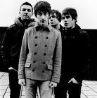 ly long and they usually put a lot of effort into how they have their hair.
I think that the Arctic Monkeys are a typical indie/rock band. They all have their own individual style, really there is no other band that looks excatly the same as this band. Heres an example of a lyric from 'A Certain Romance'
''And over there there's broken bones There's only music, so that there's new ringtones And it don't take no Sherlock Holmes To see it's a little different around here''
NME and Kerrang are currently two magazine's which cover these two genre. But NME covers the indie genre rather then the rock genre. Kerrang covers this genre in more detail. I want the magazine which I am going to publish to cover both genre's.
The features which both magazines have are:
Album and CD reviews.
Dates of gigs, any upcoming one-off gigs and tours.
Photos of these gigs and photos of bands.
Interviews with bands.
News on these bands.
Target Audience.
My main target audience is going to be anyone who is interested in the indie/rock music genre. The target audience is going to expect news on these bands featured in the chosen music genre, photos and dates of gigs etc.
To appeal to my target audience, I'm going to make sure that when I'm advertising my magazine I make sure that all the main indie/rock bands are featured in this advertisement. I'll also make sure that I get all the main features in the magazine. Such as interviews, photos, gigs and tours, reviews etc.
Potential advertisers who could feature in my magazine could be brands like:
Clothing brands.
Clubs which have indie/rock nights.
Apple (Ipod)
Drinks brands.
Technicial brands.
If I was a potential buyer of a new music magazine, I would expect to see album reviews, gigs and tours, award shows, interviews with the stars of the genre, news on the stars of the genre, photos of these tours, clubs which have indie/rock nights etc.
I think the key features of this music genre are:
The lyrics in indie/rock songs. No other genre of music really does put that much effort into the lyrics as indie/rock bands do. Usually, different music genres such as the pop music genre, don't actually write their own songs, songwriters do.
The way members of this music genre dress. The members of this genre all dress individual and don't look manufactured.
The song names. I think that the names of the songs don't actually relate to the lyrics of the songs.
Their hairstyles and the way they style their hair. These musicians all have their own individual hairstyles, usual
 ly long and they usually put a lot of effort into how they have their hair.
I think that the Arctic Monkeys are a typical indie/rock band. They all have their own individual style, really there is no other band that looks excatly the same as this band. Heres an example of a lyric from 'A Certain Romance'
''And over there there's broken bones There's only music, so that there's new ringtones And it don't take no Sherlock Holmes To see it's a little different around here''
NME and Kerrang are currently two magazine's which cover these two genre. But NME covers the indie genre rather then the rock genre. Kerrang covers this genre in more detail. I want the magazine which I am going to publish to cover both genre's.
The features which both magazines have are:
Album and CD reviews.
Dates of gigs, any upcoming one-off gigs and tours.
Photos of these gigs and photos of bands.
Interviews with bands.
News on these bands.
Target Audience.
My main target audience is going to be anyone who is interested in the indie/rock music genre. The target audience is going to expect news on these bands featured in the chosen music genre, photos and dates of gigs etc.
To appeal to my target audience, I'm going to make sure that when I'm advertising my magazine I make sure that all the main indie/rock bands are featured in this advertisement. I'll also make sure that I get all the main features in the magazine. Such as interviews, photos, gigs and tours, reviews etc.
Potential advertisers who could feature in my magazine could be brands like:
Clothing brands.
Clubs which have indie/rock nights.
Apple (Ipod)
Drinks brands.
Technicial brands.
If I was a potential buyer of a new music magazine, I would expect to see album reviews, gigs and tours, award shows, interviews with the stars of the genre, news on the stars of the genre, photos of these tours, clubs which have indie/rock nights etc.
Contents Page Shown in a Music Magazine
This is a contents page featured in a music magazine.

This contents page has all the features you would usually expect a contents page has.
At the top of the contents page, it has two quite big pictures of Fall Out Boy and Good Charlotte, both these bands are featured in the magazine. Underneath the photo of Good Charlotte, is a photo of My Chemical Romance and at the bottom of the contents page there is two more photos, once again these bands are all featured in the magazine.
On the all of the photo there is the page number which the bands are featured on.
Underneath the photo of Fall Out Boy there is all the bands which are featured in the magazine, the page numbers are all in bold black font, the bands are all written in pink bold font and then next to the bands is a little bit about what the article is about, this is written in a black smaller font.
This contents page is quite colourful, but really the only colour on the contents page comes from the photos.

This contents page has all the features you would usually expect a contents page has.
At the top of the contents page, it has two quite big pictures of Fall Out Boy and Good Charlotte, both these bands are featured in the magazine. Underneath the photo of Good Charlotte, is a photo of My Chemical Romance and at the bottom of the contents page there is two more photos, once again these bands are all featured in the magazine.
On the all of the photo there is the page number which the bands are featured on.
Underneath the photo of Fall Out Boy there is all the bands which are featured in the magazine, the page numbers are all in bold black font, the bands are all written in pink bold font and then next to the bands is a little bit about what the article is about, this is written in a black smaller font.
This contents page is quite colourful, but really the only colour on the contents page comes from the photos.
Friday, 12 December 2008
Double Page Spread Shown in a Music Magazine
This is a double page spread which was featured in NME.

A photo takes up one page of the double page spread. This is to as well as give the reader information on the 'Prodigy Twisted Hoax Starter', but to also show the reader a mock-up photo of what he or she may look like.
Across the photo are the words 'Wanted' in a red font, it's as if the words have being stamped across his forehead. The photo is in black and white.
On the second page of the double page spread is the actual article on a man who is pretending to be Prodigy's Liam Howlett. Most of the second page is taken up by the headline. The headline is written in bold black font, this is eye catching to the reader. There is also a strapline underneath the main headline. The article is arranged in three columns. The first column is a little bit longer then both the second and third column, there is a quote underneath the second and third column.
This double page spread isn't really that effective, as it's in dull colours and doesn't actually give that much infomation on The Prodigy. Usually double page spreads which are featured in NME are quite colourful and the photo goes across both the first and second page and also gives an interview with the band featured.

A photo takes up one page of the double page spread. This is to as well as give the reader information on the 'Prodigy Twisted Hoax Starter', but to also show the reader a mock-up photo of what he or she may look like.
Across the photo are the words 'Wanted' in a red font, it's as if the words have being stamped across his forehead. The photo is in black and white.
On the second page of the double page spread is the actual article on a man who is pretending to be Prodigy's Liam Howlett. Most of the second page is taken up by the headline. The headline is written in bold black font, this is eye catching to the reader. There is also a strapline underneath the main headline. The article is arranged in three columns. The first column is a little bit longer then both the second and third column, there is a quote underneath the second and third column.
This double page spread isn't really that effective, as it's in dull colours and doesn't actually give that much infomation on The Prodigy. Usually double page spreads which are featured in NME are quite colourful and the photo goes across both the first and second page and also gives an interview with the band featured.
Media Language of a Music Magazine

NME means 'new musical express'. Underneath the word NME it does actaully tell you what the title means. There are no images, concepts or myths assicated with the NME logo, to me the title looks pretty simple.

This photo is chosen because it is a photo of the band NME are featuring as the main feature in this week's magazine. Both members aren't smiling, but they don't look moody either. The right-hand side band member is smiling slightly, but it looks more like a smug look then a smile. But the left-hand side band member has a blank expression on his face. In the photo you can only really see both band members faces and a little bit of their shoulders. The right-hand side band member is standing slightly in front of the left-hand side band member, but I wouldn't say their really posing. I don't think NME is the type of magazine where the bands featured pose for photos. Both band members are wearing plain t-shirts, the only difference is one is wearing a black t-shirt and the other is wearing a white t-shirt. There is really a certain hairstyle which both the band members have, although one is wearing a bandanna. I would say that really both the members have scruffy hair styles. In the photo of MGMT the members don't really appear to have much attitude. And they don't appear to behave in any certain way, they don't seem to give off the 'I'm a rockstar I can do what I like' vibe.
The indie/rock label is being represented in these photos. Both the members of MGMT do look like they belong to the indie/rock genre. There is no women in MGMT, but women are in indie/rock bands. For example bands like The Gossip, The Ting Tings and The Long Blondes all have women singers and Beth Ditto from The Gossip has already appeared on NME's front cover.
This particular photo shows that it is mainly men who are in indie/rock bands and also that it is mainly men who appear on the front cover of NME. Women aren't really shown on the front cover of NME, but that doesn't mean that they are no women in the indie/rock industry. There are a quite a lot of women in the industry, but a lot of them are actually solo singers. Amy Winehouse and Kate Nash are examples of these solo singers.
People of a different race are quite often featured on the cover of NME magazine.
With all these people featured in NME it shows that the music business does include all types of people and no one gets left out.
Wednesday, 10 December 2008
Media Language of a Music Magazine

The font that is used on the cover of NME is all the same font, it's not a fancy font. Just a simple one. I think this is just show that NME isn't a fancy magazine, just a simple one which informs it's readers on any upcoming new bands, interviews with existing bands, album reviews and gig details.
The fonts are all the same size apart from the plugs at the bottom of the cover, which are the smallest plugs. The rest of the type is the same size. The title and the main headline are the same size type. The main headline will catch the readers eye as it is in a bigger font, also any fans of the band featured as the main article in NME will buy the magazine.
All the type on NME is in a bold font, this is to once again catch the readers eye.
There is only two photo's on the cover and one of them is a poster of a Grand Theft Auto the game. The main photo takes up most of the cover.
The people in the main photo are the two members out of the band MGMT. Both are male, there is no mix of gender on the front cover this week. But usually NME do feature bands with girls, but most of the time it's bands with men in them.
The page elements are set out like most other music magazine. There are plugs at the top and bottom, a title underneath them,then the strapline, then the main photo with the main headline across it and the barcode too.
There isn't really that much white space on the cover. The space is used to advertise plugs and the title is also in the white space too.
The colour which is used the most on the cover is red. Black, white and yellow are all used. But red is the more dominant colour. I think the colour red is used because it is more of a unisex colour and it isn't aimed at just one gender.
The images and the text don't really relate to each other, the only picture which is on the cover is of a male band, the text on the page doesn't really relate to this.
The cover gives the reader an insight to how the whloe magazine looks, the rest of the magazine uses the same colours and the same fonts as the front cover does.
Friday, 5 December 2008
Textual Analysis of a Music Magazine

NME is a indie/rock music genre magazine.
Kerrang Magazine also looks at the rock genre, but it looks at the more rockier bands whereas NME looks at independant bands.
Metal Hammer Magazine also looks at the rock genre, but it looks at the even more rockier bands then both Kerrang Magazine and NME do.
The title of the magazine doesn't link in to any other media products.
The indie/rock music genre is represented throughout the magazine. And so is the alternative music genre. The music is all in independent music genre, sometimes older indie/rock music is featured in NME alongside the newer indie/rock music. Sometimes bands which you wouldn't expect to see in NME are featured, bands which are in the more rockier music genre. NME features new indie bands too.
There are a lot of music genres which are not featured in NME. Dance, RNB Hip Hop, Pop, Classical, Punk, Screamo, Techno and Grime all are not featured in NME.
The main picture helps to indentify the genre, as all the bands featured in NME reflect the indie/rock music genre in some way.
The bands featured and the pictures which are in the music magazine all are typical of the music genre NME focuses on.
Friday, 28 November 2008
Foundation Portfolio- Main task
As part of the main task. I looked at the key media concepts, Language, Insitution, Ideology, Audience and Reprsentation and applied these to different music magazines.
Language- The layout of the magazine, the font which is used for the main headline, the plugs, the date and the strapline. Is the font bold or just in a normal font? Is it being used to emphaise anything in particular?
The main photograph which has being used. Is the photograph digtally airbrushed, is the photograph in black or white, or is the photograph in colour.
The text that has been used. Is it in a bold font, or a normal font, is it underlined, is it in colour (bright or not), is it in a black font. What size is the font?
The plugs, what are they been used to advertise, which fonts are they written in, colour or not.
The masthead, what is it been used to advertise. Is it in a regular colourful font or a boring black font. What is the article actually about and does the font represent this.
Insitution- The different types of music genres are published by different magazine publishers. Here I am going to identify different magazine publishers and the music magazine they publish.
EMAP (Bauer Media)- EMAP publish Kerrang Magazine. The Bauer Media website says that Kerrang Magazine has 'Metallica to Muse, Foo Fighters to Fall Out Boy, the UK's premier multi-platform music destination bringing you the best in rock online, on TV and in print'. The audience for Kerrang Magazine is 'individually minded, independant of thought and musically experienced, an audience defined by attitude, passion and loyality'.
IPC Media publish NME which I would say is a rival to Kerrang Magazine. NME is more of a independent music magazine, but Kerrang is more of a rock genre. IPC doesn't publish a magazine on rock magazine. Just like EMAP (Bauer Media) doesn't produce a independant music magazine. IPC Media describes NME magazine as 'the longest published and most respected music weekly in the world. Every week it gives it's readers the most exciting, most authoritative coverage of the very best in contempoary music'. IPC Media say that ' almost two in every three UK women and over 45% of UK men read an IPC magazine. That's almost 27 million adults'.
Ideology- The idea behind NME magazine is to inform fans of idependent and contempoary music the lastest news on contempoary bands and to promote the indie/ rock music genre. And to also give readers some entertainment whilst reading the magazine. My own magazine will have a similar ideology as the NME magazine does and will also promote the same genre of music and may also have the same target audeince.
Audience- My magazine will have the target age audience 16-25. My magazine will be on a certain genre of music, so anyone who is interested in that type of music will the audience of my magazine.
Representation- The type of social groups who will buy my magazine will be represented by the pictures in my magazine. The type of bands which will be featured in my magazine will represent the people who will buy my magazine. For example, dance music is represented by women in bikini's whereas indie music is represented by under 25's male and female and mainly male bands.
Tuesday, 25 November 2008
Evaulation
In what ways does your Media product use, develop or challenge forms and conventions of real Media products?
My magazine has all the conventions you would see on any other magazine. It has plugs, a title, a price, date and issue number, strap line, barcode, main headline, main photo and more plugs.
I have used plugs which will directly appeal to students (NUS card and the benefits, UCAS application forms, Party pictures)
I have also used a headline which will directly appeal to students (Exam Stress article). The main headline is in a bold font and written across the main picture which covers nearly all of the magazine, this is a feature you would normally see on a real magazine.
How does your Media product represent particular social groups?
My magazine represents the student social group as it is a college magazine and the minority of people who will read it will be students.
The plugs and headline which I used on my magazine also represent students. The NUS card represents students as liking to get a discount on certain items as that is what the NUS card is for.
The Halloween party pictures shows that students like to go out and have a good time after college hours.
The exam stress article shows that nearly all students who have any upcoming exams do worry about them and feel pressured to do well. And once they have passed their AS levels and are thinking about going to university they will have to fill out a UCAS application form (which is another plug on my magazine). Students may be struggling to fill out this application form, so I thought the article would help.
So basically my magazine represents the student social group as liking to get discounts on certain items, liking to have a good time, stressing out over exams and once that’s all over going to university.
What kind of Media institution might distribute your Media product and why?
A publishing company might publish my college magazine. I would have to take my magazine to a publishing company who doesn’t already a publish a college magazine because if they already publish a college magazine the two magazines may be in competition with each other. I have looked on the internet and I have found a magazine publisher called ‘S&G magazines’ they publish over 300 different magazines and are based in South Wales. To get my magazine published, I would take my idea of a college magazine for Wyke College students and if they liked the idea of a college magazine, then my magazine would be published.
Who would be the audience for your Media product?
The audience for my magazine would be Wyke College students both male and female, Wyke College teachers both male and female and the parents of Wyke College students. The target age of my audience would be 16-19 year olds because that is the age of most students at Wyke College. Year 11 students who are coming to Wyke in the next college year may also be interested to read the magazine as it will give them a idea of what Wyke College is like and what events happen at the college.
How did you attract/address your audience?
I attracted my audience by putting on plugs which I knew would relevant to most students. I used the NUS card and the discount students get as a plug, because most students don’t have that much money so I knew that advertising the card would appeal to a lot of students as this is a card that will get students money off clothes, food and to the cinema.
I used the UCAS application forms as a plug, because second year students will have started applying for university and to get into university you need to have filled out a UCAS application form correctly. Some of the second year students could be struggling with this, so I decided to advertise help that will make sure their UCAS forms are all filled out correctly.
I used the Halloween party pictures as a plug, because as most students did actually go to that party they will want to see the pictures which have being taken and if they are in any of them.
I used ‘Exam Stress?! Top distressing tips inside!’ as a main headline and had a picture of a student looking stressed, because all students feel pressured and stressed to do well in exams. And some worry more than others, so I decided that this will appeal to students as they will want to see what distressing tips are inside and if they will work.
The colours which I used for the plugs at the top of the magazine are written in pink and blue. To show that the magazine is for both male and female students and these colours represent that.
I decided to call my magazine ‘Chatter’ as it is a ideal name for a college gossip magazine and a magazine which makes sure the students get all the information they need about upcoming events at the college and all the pictures and stories from past events which have already happened at the college.
I used bright colours to catch the readers eye. I think that most people would like to read a magazine which is colourful rather then a dull coloured magazine. I know that people read magazines for their content which is why I made sure the plugs and headline was in bright colours too, catching the readers eye again.
What have you learnt about technologies from the process of constructing this product?
I have learnt that Photoshop isn’t as easy to use as it looks. In class we did get a class on how to use Photoshop which was helpful. I’ve learnt that Photoshop is better for editing and resizing images, but Publisher is better for actually making the magazine as it is simpler to use. And I think the end product looks better. I made a magazine cover in both Photoshop and Publisher, and the Photoshop copy looked like a poster but the Publisher copy looked more like a magazine.
Looking back at the preliminary task, what do you feel you have learnt in the progression from it to the full product?
I have learnt from the preliminary task, how to use Photoshop properly. I learnt how to edit an image and make the quality of the photo look better and also if the person in the picture has bad skin, I’ve leant how to use the cloning tool. To use the cloning tool you clone a bit of the person’s skin which is clear and then apply it to the bit of skin that isn’t clear and it gets rid of the person’s bad skin.
I have also learnt how to make the picture look bigger then it is without pixalating the image. I have learnt how to use the cropping tool as well.
I’ve learnt that Microsoft Publisher is better for publishing and making magazine front covers, the Photoshop. Well that’s just my opinion, but Photoshop is better for editing the image whereas Publisher is better for making the magazine because it is a lot simpler to use.
I’ve also learnt that you don’t need to put a lot of fancy writing and colour onto a magazine to make it look good. Often the simpler fonts and less colour make the magazine look more realist then fancy fonts and lots of colour. Also you do not need to put lots of plugs on the magazine to make it more appealing, if you just put a few plugs which will defiantly appeal to students, for example student discounts, UCAS application forms and pictures from parties.
Final Contents Page

This is my final contents page.
At the top of my contents page, I have the title of the college magazine written in the same font as on the front cover of the magazine.
Underneath this I have the words 'Contents Page'. The word 'contents' is written in a bold purple font and the word 'page is written in a bold green font. Next to this I have where the magazine is published in a purple font, who published the magazine in a green font and the student who is on the front page of the magazine in a purple font.
The four plugs which are featured on the front cover are all on my contents page with pictures next to them.
Final Front Cover

This is my final college magazine.
I have four plugs at the top of my magazine which are written in both blue and pink font. I have used these colours because the magazine is a unisex magazine and both male and female students will buy the magazine. The plugs at the top say 'stories', 'pictures', 'games' and 'more...'. I used these as plugs as students may be interested to look at the pictures in the magazine, for example any sports pictures. Or read any stories about the college sports teams or if anyone has done really well in a certain subject and is featured in the magazine.
Underneath the plugs, I have the title of the magazine which is called 'Chatter'. I have used a bold Comic Sans font for the title and the word 'Chatter' is written in both a green and a purple font. I used 'Chatter' as the name of my college magazine as it is a ideal name for a college magazine. And also people go to college to learn and also use it as a good time to 'chatter' to their friends.
Underneath the main headline, I have the issue number in a pink font and the date in a blue font. I used pink and blue again as the magazine is a unisex magazine.
Underneath the strapline I have the main picture which I took of a student surrounded by books and she has a stressed look on her face. The main headline which is written across the main picture says 'Exam Stress?! Top destressing tips inside'. This is written in a purple font, I used this as a main headline because a lot of students at college will be stressing over exams and this article will appeal to them.
I also have three other plugs written on the main picture which are giving infomation on the Halloween party which was at Welly, giving infomation on the NUS cards and the benefits of having one and how to fill out a UCAS application form.
Also on my front cover I have the barcode and the price.
Friday, 14 November 2008
The Pictures For My Front Cover
I took two pictures for my front cover. I wanted the picture to be a picture of a student who is stressed because of the exams and all the pressure which gets put upon students. I used some props in my picture, these were some books surrounding the student.
I decided to not use the first picture as you couldn't really see the books which surrounded her. Also the student didn't really look that stressed out about the exams, you also couldn't really see her face and the expression on her face. You could only see her eye, which didn't really give off any idea as to what the expression on her face was.
I decided to use the second picture as you could see the props around her and also she looked more like a stressed student then she actually did in the other picture. You could also see the stressed expression on her face. To get all the books in which surrounded her, I took the picture from above the student.


I decided to not use the first picture as you couldn't really see the books which surrounded her. Also the student didn't really look that stressed out about the exams, you also couldn't really see her face and the expression on her face. You could only see her eye, which didn't really give off any idea as to what the expression on her face was.
I decided to use the second picture as you could see the props around her and also she looked more like a stressed student then she actually did in the other picture. You could also see the stressed expression on her face. To get all the books in which surrounded her, I took the picture from above the student.


Subscribe to:
Posts (Atom)